



Resumes
August 13, 2026


.webp)
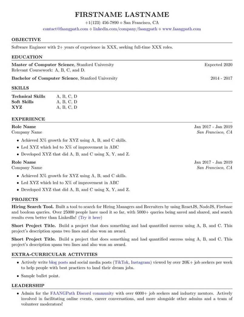
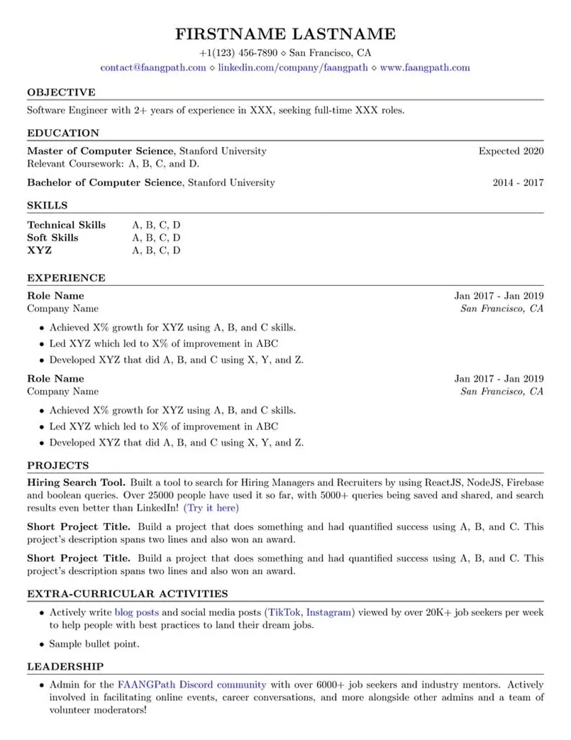
Data visualization is a field where the resume itself is a test of the skill: can you present your own work clearly, with the right numbers, in the space available? The 5 examples below cover a data visualization designer in healthcare analytics, a Power BI specialist consolidating reports for an energy company, a visualization expert leading a practice at a policy institute, a data visualization analyst in marketing analytics, and a visualization developer building charting libraries for a software product. Each one shows how to quantify dashboards built, users served, time-to-insight, render performance, and decisions influenced.
Meet Priyanka, a fictional senior data visualization designer with 6 years in healthcare analytics who maintains 45 production dashboards used by about 6,000 people and cut time-to-insight for quality reporting from 2 weeks to same day.
(617) 555-0158 ◇ Cambridge, MA
priyanka.raman@example.com ◇ linkedin.com/in/priyanka-raman ◇ priyankaraman.com
Data visualization professional with 6 years turning complex datasets into dashboards, reports, and interactive stories for a healthcare analytics company serving 90 hospital systems. Built and maintains 45 production dashboards used by about 6,000 clinicians and executives, cut average time-to-insight for quality reporting from 2 weeks to same day, and holds a 4.7 out of 5 user satisfaction rating across 1,200 survey responses. Designs every chart around the decision it needs to support, and removes everything that gets in the way.
Coursework in Visual Perception, Information Design, Statistical Graphics, Interactive Visualization, and Data Storytelling.
Coursework in Probability, Regression, Experimental Design, Data Analysis with R, and Databases. Also holds a Tableau Desktop Certified Professional credential earned in 2021.
Quality Reporting Dashboard Suite. Replaced 30 static monthly quality reports with 8 interactive dashboards covering 120 clinical measures, designed through 25 clinician interviews and 4 rounds of usability testing, with drill-down from system to unit level, which cut time-to-insight from 2 weeks to same day and is used by 6,000 people across 90 hospital systems.
Analytics Design System. Built a design system with 40 chart templates, a colour palette tested for 3 types of colour vision deficiency, typography and layout rules, and a 50-page guide, rolled out to 14 analysts through 5 workshops, which cut dashboard build time 40% and raised satisfaction scores from 4.1 to 4.7.
Executive Claims Dashboard Redesign. Redesigned an executive dashboard at a previous employer by observing 12 leaders using the original, identifying the 10 questions they actually asked, and rebuilding around those with a 1-page summary and 5 drill-downs, which cut time to answer those questions 60% and raised weekly active use from 40% to 85% of the leadership team.
Meet Fernanda, a fictional data visualization specialist with 5 years at an energy company who consolidated 140 legacy reports into 60 certified Power BI reports and raised monthly active users from 900 to 2,500.
(713) 555-0134 ◇ Houston, TX
fernanda.quiroga@example.com ◇ linkedin.com/in/fernanda-quiroga ◇ fernandaquiroga.com
Data visualization specialist with 5 years supporting operations and finance teams at an energy company, owning a portfolio of 60 Power BI reports used by 2,500 employees across 4 business units. Consolidated 140 legacy reports into 60 certified ones, cut report maintenance hours 55%, and raised monthly active users from 900 to 2,500 through redesign and training. Delivers about 20 new or redesigned reports a year with a 95% on-time rate. Specialises in making operational data readable by the people who have 5 minutes and a decision to make.
Coursework in Business Intelligence, Database Management, Data Analytics, Statistics, and Project Management.
Also completed a data visualization design course in 2022 and a DAX advanced modelling course in 2023.
Report Consolidation Programme. Inventoried 140 legacy reports across 4 business units, interviewed 45 report owners, mapped 35 conflicting metric definitions to a single agreed set, and rebuilt the portfolio as 60 certified reports on 6 shared data models over 18 months, which cut maintenance hours 55% and cut metric disputes in monthly reviews to 0.
Field Operations Mobile Reports. Designed mobile layouts for 12 operations reports used by 600 field supervisors, with a 3-metric summary view, offline snapshots, and alerts for 8 threshold breaches, tested with 20 supervisors on site, which raised field usage from 15% to 70% of supervisors and cut time to spot a production issue from a day to under 2 hours.
Report Adoption Programme. Built an adoption programme with usage dashboards, a report certification badge, 20 training sessions a year, and weekly office hours, tracked against a target of 2,000 monthly active users, which raised monthly active users from 900 to 2,500 and retired 30 reports with 0 users.
Meet Hamish, a fictional director of data visualization with 12 years in journalism and research who directed 150 published visual projects including 12 national award winners and built a charting library used by 120 researchers.
(202) 555-0181 ◇ Washington, DC
hamish.macleod@example.com ◇ linkedin.com/in/hamish-macleod ◇ hamishmacleod.com
Data visualization expert with 12 years in journalism, research, and consulting, currently leading the visualization practice at a public policy research organisation with 200 researchers and a public audience of about 3 million readers a year. Directed 150 published visual projects including 12 that won national data journalism or information design awards, built the organisation charting library and style guide, and raised average time on visual reports 70% compared with text-only reports. Teaches visualization to about 300 people a year. Believes a chart is an argument, and holds it to the same standard of evidence as a paragraph.
Coursework in Statistical Reporting, Information Graphics, Interactive Storytelling, Data Analysis, and Visual Ethics.
Double major with coursework in Econometrics, Statistics, Typography, and Information Design. Also completed a cartography and geospatial visualization course in 2019.
Institute Charting Library and Style Guide. Designed a charting library of 60 chart types in D3 and Vega-Lite with R and Python wrappers, an accessibility layer with text alternatives, and a 90-page style guide covering chart choice, colour, annotation, and uncertainty, rolled out through 15 workshops, which cut standard chart production time 65% and brought 120 researchers onto a single visual standard.
County Economic Mobility Atlas. Directed an interactive atlas visualising 40 years of economic mobility data for 3,100 counties with 12 linked views, small multiples, and a narrative layer, built with a team of 5 over 8 months, which reached 1.2 million readers, was cited in 30 news outlets and 4 congressional hearings, and won a national information design award.
Election Night Results System. Led design and build of a live results graphics system at a previous employer with 50 map and chart components, automated data validation with 20 checks, and a rehearsal programme of 6 full run-throughs, which served 40 million page views across 3 election nights with 0 data errors and a median update latency of 30 seconds.
Meet Ayesha, a fictional data visualization analyst with 4 years in marketing analytics who maintains 25 Tableau dashboards for 350 users and produced visual analyses that informed $30M in budget reallocations.
(312) 555-0126 ◇ Chicago, IL
ayesha.chowdhury@example.com ◇ linkedin.com/in/ayesha-chowdhury ◇ ayeshachowdhury.com
Data visualization analyst with 4 years supporting marketing and sales analytics at a consumer goods company, building the dashboards and visual analyses behind a $400M annual marketing budget. Maintains 25 Tableau dashboards used by 350 marketers and sales leaders, produced about 120 visual analyses a year that informed budget reallocations worth $30M, and cut the weekly performance review preparation from 8 hours to 1 through automation. Pairs analysis with visualization so that the chart and the finding arrive together.
Coursework in Data Visualization, Statistics, Marketing Analytics, Database Systems, and Programming in Python and R.
Also completed a data storytelling course in 2023 and a SQL for analysts course in 2022.
Marketing Budget Allocation Dashboard. Built a Tableau dashboard comparing spend, reach, and return across 12 brands and 8 channels with a scenario view for reallocation, designed with 10 brand managers and refreshed daily from Snowflake, which supported $30M in budget reallocations in 2025 and became the standard view in the monthly marketing leadership meeting.
Weekly Review Automation. Automated the weekly performance review by moving 15 manual data pulls into scheduled SQL and Alteryx workflows, building a 20-slide deck template linked to Tableau, and adding 10 automated data checks, which cut preparation from 8 hours to 1 and eliminated 4 recurring data errors.
A/B Test Readout Template. Designed a 1-page visual readout template for A/B tests at a previous employer showing lift, confidence, and segment breakdown with consistent chart types and annotation rules, used for 40 tests a year, which cut readout preparation 60% and cut misreadings of inconclusive tests raised by stakeholders by about half.
Meet Julien, a fictional lead data visualization developer with 7 years building interactive visualizations who owns a 35-component charting library and cut chart render time 80% through WebGL rendering.
(206) 555-0139 ◇ Seattle, WA
julien.baptiste@example.com ◇ linkedin.com/in/julien-baptiste ◇ julienbaptiste.com
Data visualization developer with 7 years building custom interactive visualizations and charting components for software products, currently the lead visualization engineer for an analytics platform with 40,000 daily active users. Built the platform charting library of 35 components rendering up to 2 million data points at 60 frames per second, cut chart render time 80% through WebGL and data aggregation, and shipped 20 visualization features that raised chart interaction rates 45%. Writes visualization code that is fast, accessible, and correct about the data it shows.
Coursework in Computer Graphics, Data Structures, Algorithms, Web Development, Human-Computer Interaction, and Databases.
Part-time programme covering Visual Perception, Statistical Graphics, Interactive Visualization Design, and Visualization Evaluation.
Platform Charting Library. Designed a charting library of 35 React and D3 components with a declarative configuration API, shared scales and colour system, keyboard and screen reader support, and 400 Storybook examples, adopted across 12 product areas by 30 developers, which cut time to add a chart to a feature from about a week to a day and unified 5 inconsistent chart implementations.
WebGL Large Data Rendering. Built a WebGL rendering path with regl for scatter, line, and heatmap charts with level-of-detail aggregation computed server-side and progressive loading, benchmarked across 6 browser and device combinations, which cut render time 80% and rendered up to 2 million points at 60 frames per second on a laptop.
Visual Regression Testing System. Built a visual regression pipeline at a previous employer capturing 200 chart states in Playwright with pixel and structural comparison and a review interface for accepted changes, which cut visualization bug reports 60% and caught 90 rendering regressions before release in 2 years.
Sign up now to access Careerflow’s powerful suite of AI tools and take the first step toward landing your dream job.

.webp)

%20Which%20Should%20You%20Use.webp)